Modal
Also known as: Pop-up window
Modals focus the user’s attention exclusively on one task or piece of information via a window that sits on top of the page content. They require the user to take an action.
Examples
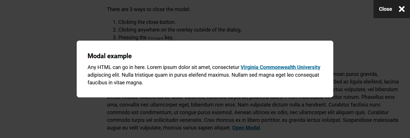
Open the example modal.
Code reference
When to use
Modals are used to reveal critical information, show information without losing context or prompt a user response. Modals focus the user's attention on a single piece of content without taking them to a new screen.
How to use
Creating a modal
- Access t4.vcu.edu and navigate to the page you would like to update.
- Use the T4 "Plugin - Modal" content type.
- Enter content in the required name, title and content fields.
Linking a modal
- Open the T4 content type where you would like to place the modal link.
- Highlight the link text and select "Insert content link" from the WYSIWYG (what you see is what you get) menu.
- Select the page where the modal is saved, then select the modal content you would like to use.
Tips
- Anything that you can use in a general content WYSIWYG can be displayed in a modal.
- Modals can not be set to load automatically; they can only be triggered through user actions: a button click, following a link or selecting an option.
- Modals interrupt the user’s workflow, so use sparingly.
Requirements
All modals require:
- Name (will only be visible in T4)
- Title (this is what users will see at the top of the modal window)
- Content to go inside the modal window
Accessibility considerations
- Each modal must have a unique title that clearly describes the modal content.
- Trigger links should include meaningful text and information as to their end location.
- Use aria-labels for trigger links that have the same text so screen readers can interpret the difference in the links.
- Content within each modal must meet web accessibility standards.