Colors
Our colors say a lot about who we are. They help identify us at a glance, and set the tone for our communications, from bold and powerful, to inspirational and passionate. They also must be selected carefully to meet accessibility standards.
Primary palette – digital
- #FFB300
- #000000
- #FFFFFF
Instantly recognizable as VCU, our core colors should dominate all digital communications, including:
- Website pages
- Digital advertisements
- Email newsletters
VCU Academic’s primary print and web palettes directly align, fostering visual continuity and reinforcing brand recognition across mediums. Do not substitute other colors for these primary colors.
Secondary palette – digital
- #DEDEDE
- #B02E01
- #8E6A90
- #006894
- #0B652E
Secondary colors serve to complement and enhance the primary palette rather than overshadowing it. While primary colors define the overall aesthetic, secondary hues can accentuate supporting elements and draw attention to specific content or calls to action.
VCU’s secondary digital color palette deliberately excludes tints and shades to streamline user interface elements and aid in accessibility. VCU’s secondary digital color palette prioritizes digital functionality and brand engagement while retaining core identity elements.
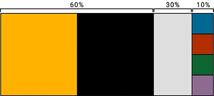
This palette should be applied with the following percentages in mind.